Monday, May 9, 2016

Navigating with a Map and GPS

Navigation with a Map and GPS

Introduction:

The goal of this activity was to use a navigational map that was created a few weeks ago to navigate a course through the forest to different way-points as assigned by the instructor. The only tools we had to use where the navigational maps, one of these is seen in figure 1, and an Etrex GPS as seen in figure 2. The points were given on a sheet of paper and we had to travel from one point to the next collecting way-points all the while collecting a track log of where we traveled so a path from one point to another could be seen.
 Figure 1: The navigation map used for the project.
Figure 2: An Etrex GPS was used to gather simple points and a travel track.

Methods:

The first step of the afternoon was to plot out the assigned points onto the 11x17 printout of the navigation map. This enabled the group to visualize where, in reference to the other points assigned, each point was. The most direct path to each point was then figured out with a goal of zig-zagging through the woods as little as possible. The GPS was set to collect points in Wisconsin UTM Meters and the project began. As we walked a track collected points along our path so that an overall travel route would be visible then when the exact coordinated of the points assigned were reached a way-point was added.


Figure 3: Point #1: Point one was collected as a light drizzle began to fall. There were large storm clouds on the horizon highlighting the fact that any type of weather can occur in the field and it is important to be prepared.
Figure 3: Point #2: At each data point a geotagged photo was taken as the way point was collected as proof of out finding the location in case there was a GPS technical error.

Figure 4: Point #3: Armed with a map print out, a GPS, and coordinated for assigned points, navigation
Figure 5: Point #4: Finding the exact point required several double checks and turning in circles to arrive at the exact location.

Figure 6: Point #5: The woods we navigated through were thick with the invasive species buck thorn and required a lot of changing of course to get by dead falls and ravines.

Results:

The final product of the track is visible in figure 7 as a map simplified to show the track traveled. The 50 meter grid lines were useful when determining what lines to take to the next point. The grids were used to determine rough distances between points to decide which points to collect first. Our best determined route was to go from point 2 to 4 then across to 5 and up to 1 then finally down to 3 for the very last point.
My group used different methods  to get from each point to the next, most of the time a simple walking in the right direction until coordinates were narrowed down was used. When going from point 4 to 5 I held the GPS and wanted to try to use the pace count to go straight through the woods in the right direction to arrive at the point,Point 5 was 183 of my paces away from point 4. The use of this pace practice is visible on the map as a heading was taken and that direction was followed until 183 paces were reached and distance on the GPS was checked. Mild correction was needed but overall it was accurate.


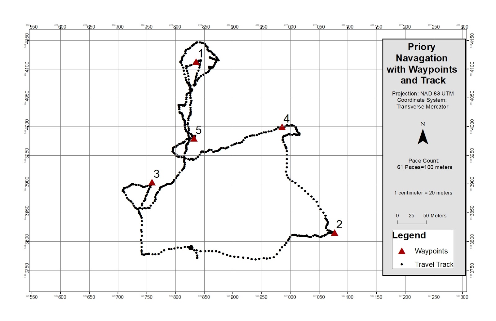
Figure 7: This simple display easily shows the track taken to and from points while on the navigation route as well as the way-points.

Discussion:

The navigation map worked surprisingly well and with each point that was collected we felt more and more confident. The hardest part was keeping the numbers in the correct order when comparing desired location to current location on the GPS, often times the numbers got jumbled and the coordinate sheet had to be referenced several times. My favorite part of this lab was absolutely seeing how accurate pace and a heading can be when going from point 4 to 5, though several scratches were gathered on that route as an attempt to maintain a straight line it was neat to use a different very basic navigation method.
Clearly, as seen on the map, some points were much easier to find, in some cases we found ourselves wandering about in circles only to arrive back at a point we had been at minutes before as seen in the case of way-point #1. Not every point was as easy to gather as the first point but overall we proved that we could use basic navigation relying on coordinates and a compass on the GPS as well as a pace count to go from point to point with relatively few errors and problems. After this lab I know better how to navigate with a map and feel confident in relying on a map I myself made to travel on an assigned route.
.


Monday, May 2, 2016

Pix 4D Demo

Processing UAS Data in Pix 4D

Introduction:

The purpose of the activity for this week is to become familiar with running a file from a UAS in Pix 4D to create a 3D map. The program uses the geocoded points connected to the image files as a "geotag" to create a point cloud. The images are combined into one image and the z value is added to that image to push it up or down depending on the collected elevation.

In order to do this the pixels of each image have to be laid on top of one another perfectly to create the combined image. The connection points the images use to link up are called keypoints. It takes two keypoints to create one 3D point. There must be at least two keypoints or there is no way to create a 3D image. If the are of interest is rather bland or featureless there is a need for even more keypoints as it is more difficult to connect the images when they are so similar. Often times it will help to know whether or not sufficient points were gathered for coverage(figure 1). To test this a process called "rapid check" can be used. This is a tool that sacrifices accuracy for speed and quickly runs a low quality check on the data to ensure proper coverage.
For larger projects it is likely that multiple flights will need to be done to cover the study area. Though the data is stored in a separate file, Pix4D can still run analysis on multiple flights at once. However the pilot has to be sure of a few things, the conditions have to be similar to ensure data integrity and there must be sufficient overlap to connect the keypoints.
Pix4D also has the ability to process oblique images(figure2). These are images that are taken at 90 degrees or more from the surface of the Earth. A traditional aerial image we tend to think of is taken from 0 degrees, straight down at the Earth. Oblique images are taken of things like towers and buildings. If no ground control points are used, if there is nothing tying the data to a specific place on the ground, there is still a possibility of an output. Though they are highly recommended they are not needed to create a result with no scale, orientation, or any positional information
At the end of running a project a quality report is displayed. This appears after each step is run as a way to check in on the progress of a project, sort of like a print statement in PyScripter. 

Figure 1: This figure displays how much overlap between taken points is needed between two flights in order to link them,

Figure 2: This diagram displays what it means to collect data from images taken at different angles to the ground. 


Methods:

In this exercise the simple application of running the program to create a 3D map was done. To do this a folder of images is added to the program as a "new project". Some specifications can be set at this point and then the initial analysis of the images is run. This is the section where the keypoints within the rasters are connected together and their geotags link them to the location they were taken on the globe, giving them spatial reference. 
In the case of this project, 80 photographers were used and went through initial processing. This process took well over an hour. Once done however, the program had created several links between images allowing for a 3D image to be eventually created, these connection can be seen in figure 3. The connected images combine to form one image with 3D capability (figure 3).

Figure 3: The geotags on each image are used to connect images to each other, the more lines connecting points, the more reliable the connection between images is. This graphic shows that the images in this project have very high connectivity.


Results:

After the program is run, several things can be done with the data and resulting images. One of the first images created with the data, displayed in the quality check is figure 4, displaying the elevation of the points as well as a compiled image creating one picture of the track area that was constructed of several images from the drone.
Figure 4: A result of the initial processing showing the compiled image on the left and the raised features on the right.


Figure 5: The combined DEM of the images gathered from the UAS with a spatial reference.

Conclusion:

The goal of this activity was to become familiar with using images from a UAS in Pix4D as an introduction to what can be done with this kind of data. One of the features that can be done is a 3D fly over where an animation is made of a view going over and around the area of interest. This file is a .gif that displays what the image looks like from what the UAS saw as it collected points. One of the issues I encountered with this activity was exporting that .gif as the default was to an excel or .csv file format which did not help. What I needed was a short video clip exported as a video file not a text file. I also had trouble with the aspect of calulating volume of an object. I was able to trace the shed shown along the track on the bottom right of the image but could not calculated meters cubed. There are more things that can be done with this data and hopefully more will be done as I am able to work some of the programs within Pix4D such as the fly over and calculating the volume of an object in the AOI. As this is an introduction I hope to get a little more experience and be able to do some of the more analytical aspects of this program. I have gathered a brief understanding but certainly need more experience working with this program to become efficient with it. 


Tuesday, April 19, 2016

Creating a Topographic Survey for the UWEC Campus

Topographic Survey

Introduction:

When conducting a survey of points that need absolute accuracy, such as points for construction, a survey grade GPS is used. The goal of this activity was to become familiar with the basics of how one of these systems works and some of the advantages of this tool. Attributes would be collected with millimeter accuracy and placed over an imagery basemap to display the features collected.

Methods:

A Topcon Survey GPS was used to collect points in and around the parking lot to the South of Davies Student Center on the University of Wisconsin Eau Claire campus. Attributes being collected included trees, garbage cans, mailboxes, and light posts. The accuracy of the station can be set up depending on the accuracy needed for the specific point. The tall staff with the beacon on the top seen below in figure one as the black post, is where the point is collected using the tripod design for stability. A point is collected based on an average of points continually taken. Accuracy is increased from "Auto" to "Fix". An auto point is collected by taking an average of 20 points to create the point feature, a fix point is taken from an average of 30 points. Both points are extremely accurate and the degree of error in the auto point taken in figure one is a potential for 3mm of error.
Different groups switched out throughout the period of surveying so that everyone would get hands on experience. The final list of attributes collected where put into an Excel spreadsheet which could then be added into ArcMap by "Add XY Data". The surveyed points appear with a high degree of accuracy on a basemap of the campus.
Figure 1: The Topcon Survey grade GPS was set up to collect attributes including trees, trash bins, mailboxes, and light posts.

Discussion and Conclusion:

The process of actually collecting and setting up this GPS is remarkably simple. It is essentially the same thing as a simple hand help GPS only this system is accurate to the millimeter. From the surveyed points a map of the area behind Davies Center could be created. While this is a simple application for such an advanced tool it is obvious that much more advanced applications could be used and points could be gathered to a high degree of accuracy where it actually meters. The biggest issue for me in this lab cam from the fact that the points collected and placed into an attribute table were in decimal degrees and had a massive amount of issues being projected onto a basemap. I could add the points and the would appear correct based on relative location and orientation in the ArcMap workstation however a basemap could not be projected under the points in the right location. Several attempts were made at reprojecting points and setting coordinate systems and projections yet I could not get the two to agree. This is an issue I have been able to solve before and certainly one I will continue to work on as correcting this is an essential skill. 

Topographic Survey with Total Station

Topographic Survey with a Total Station

Introduction:


The field activity for this week was the creation of a topographic survey of the mall area on the University of Wisconsin Eau Claire campus. The style of survey, the use of a total station, is similar to a test done a couple of weeks ago where the survey was conducted with distance/azimuth methods. The only change is that here, with a totally station, points are far more accurate and a "z" value can be given. The collected points will be placed into ArcMap and displayed using interpolation methods to show the topology. This survey is similar to the "Survey of a Terrain Surface" lab at the beginning of this blog. Only this time a real landscape not a constructed model is being surveyed and points are far more accurate with the total station than collected on the model terrain.


Methods


The station is set up and begins gathering points to millimeter accuracy. The survey grade GPS averages out these points to create an "anchor point" or a point of reference for the rest of the points that will be collected. This is also called a "static point", from the creation of this point the station cannot be touched or collected points will be ruined as the point of reference will have changed. The survey grade GPS by Topcon is seen in figure 1. Points are collected in the similar manner that they are in a Distance/Azimuth survey, the total station is told where dew North is and an azimuth and distance are taken from the static point. The difference is the "z" value addition. This addition is done by shooting a laser from the totally station, figure 4, to a prism pole, figure 2. The prism pole is the receptor of the laser beam and provides the total station with the exact distance the laser travelled to hit that point. The mirror on the prism pole is seen in figure 3The "z" value is collected as the change in height from the total station to the prism pole. The height of the total station off the ground is accounted for and the height of the prism on the prism pole is also accounted for by entering in the height that the pole is raised. Once these two values are taken the difference is recorded as the z value.
Figure 1: This GPS is connected to the total station so that it can record the points collected from the prism pole. Gathered points are added immediately to the display.

Figure 2: In order to ensure an accurate point the prism pole shown here must be level. The prism itself is out of the frame and on top of the pole.
Figure 3: This is the prism itself. The viewfinder in the total station is lined up to the reflective surface and a point is gathered bt bouncing a laser off the mirror. Source: http://www.ebay.com/itm/100-brand-new-mini-prism-with-4-poles-for-offset-0-30-total-stations-/151020419979

Figure 4: The total station. Visible in this picture is also the area of interest with the slope around the Little Niagara Creek visible in the background. The viewfinder is the black circle on the face of the station. It is through this that the station is lined up and the laser shot at the prism.


Results:

The data collected from the total station was put into a text file (figure 5) and could be added into arcscene to create a 3D rendering of the points that were collected. The end product was a 3D image using the TIN interpolation method to display the slopes on either side of the Little Niagara Creek. The final image, figure 6, displays measured heights from the total station in meters. The elevations collected with the station gave a fairly accurate result as the output TIN matches the location surveyed.

Figure 5: The attribute table from arcmap of the collected points for interpolation.

Figure 6: The final 3D image of the area of interest.

Conclusion:

The TIN interpolation method worked for the display of the 3D data though other interpolation methods would likely have worked just as well. The total station was able to collect the height of the measured points down to the hundredth meter, an incredibly accurate way to survey points. Of course there were possible errors such as the total station being bumped, the prism pole moving, and data entry which can always be part of a problem. Overall the end product produced an accurate 3D representation of the study area.


Wednesday, April 6, 2016

Distance/Azimuth Survey

Introduction:


The Field Activity for this week was once again upset by the ever changing weather conditions of Wisconsin in the spring. The original plan was to survey tree species in Putnam Park on the University of Wisconsin Eau Claire Campus however a mix of snow, rain, and sleet, changed the activity. The alternative was the collection of tree species points on the campus mall, to the West of Phillips Science Hall as shown in the map inset in figure (figure 8). This study area contained a small stream, walking paths, and several trees planted, of various ages, along the stream area. The area of study can be seen in a photo shown from the perspective of the anchor point for the data in figure 1. The goal of this particular activity was to collect points with a spatial reference without relying on a GPS to take points and specific information on that GPS device. Essentially, if there is a technical difficulty in the field, how can an accurate survey still be conducted.

Figure 1: A view from the anchor point towards Phillips Hall and the trees being collected as points.


Methods:


The survey method employed is called a Distance/Azimuth Survey. To run the survey one point is collected with an exact location. From that point, all other points are simply a reference. In order to transfer the desired points into something with a spatial reference two things are needed, the distance to the point to be collected and the azimuth. Distance was collected in meters using Sonic Combo Pro (figure 2) to shoot a sound wave to a collecting beacon held at breast height on the tree being measured. Azimuth is a attribute collected in degrees using the angle away from 0 degrees, or North, the azimuth is an angle measurement from the anchor point. To collect azimuth a TruPulse 360B(figure 3) was used. Seventeen different trees were surveyed with the following information, distance in meters, azimuth in degrees, circumference at breast height, and species. The location in decimal degrees was collected for the position of the anchor point. Together, the collected attributes provide a location of the tree, and the physical information on the tree provides an idea of size and appearance.
The collected data was transferred into a "Share" Excel file and was then converted into X and Y Data points in ArcMap. The decimal degrees measurement was converted into longitude and latitude for mapping purposes and combined into the attribute table in figure 4. The repeat in points seen in the table will be addressed later. "Bearing distance to line" was the first tool used with the purpose of using distance and azimuth to create lines from the anchor point to the collected tree points, the effects of this tool can be seen figure 5, the ESRI definition for this tool is in figure 6. Then the "feature vertices to points" tool added points onto the end of the lines created, the lines were subtracted and only points remained. The ESRI definition for how this tool functions is in figure 7. This data set had to be checked for spatial reference and was reprojected into the GCS_WGS_1984 projection.
The resulting point feature class was placed onto a basemap of the UWEC campus and a map was created to show results (figure 8). The result is a fairly accurate tree survey.


Figure 2: Held to chest height and shot at a receiver the Sonic Combo Pro collected distance in meters.

Figure 3: The TruPulse 360B could be looked through like a mono-scope and a pulse was sent to what was in the crosshairs to measure distance and azimuth.
Figure 4: An attribute table in ArcMap of collected points.


Figure 5: The resulting lines from the bearing distance to line tool.
Figure 6: The ESRI definition of the Bearing Distance to Line tool.
Figure 7:The ESRI explanation of how points are placed with the Feature Vertices to Points tool.


Discussion:


Distance/Azimuth surveying is not without its difficulties or its errors. In fact is was clear to see how errors could occur quite easily. The rain occurring during surveying could have scattered the laser and sound waves damaging the integrity of distance and degree measurements. The point data is also not perfect, as visible in the resulting map there are some species of trees that appear to be growing inside of Phillips Hall, it seems that the farther away from the survey tools the trees are, the less accurate point collection is. There were also several problems when converting the data from a field notebook to an excel file and into ArcMap. At first points were placed in the ocean and data was in decimal degrees not meters. The problem was that the X and Y fields in the Excel file had been switched and was placing the data in the southern hemisphere. A simple issue to fix once the problem is realized but certainly a good lesson in paying attention to the most basic of geospatial methods. The result was a doubled attribute table as stated earlier, this was able to be ignored as quantity was not measured, just location.
Figure 8: The resulting map from the Distance/Azimuth survey of trees by Phillips Hall.


Conclusion:


This is not a perfectly accurate way to survey anything. It certainly has its errors but it still a reliable way to get relative points onto a map. There would be ways to conduct this survey again to make for less errors and difficulties but it would never be as perfect as a survey grade GPS.
If done again more points would be collected at varying distances from the anchor point to get more variance in accuracy. That data set would then be compared to points collected at the same location with more accurate equipment so that the error margin could be studied.
This field activity was helpful for seeing how there are more than just one way to collect points when technical difficulties arise in the field.

Tuesday, March 15, 2016

PLSS Seminar at the University of Wisconsin Eau Claire Overview


Parcel Mapping and the PLSS
              
The attended seminar I was available to attend was from 2:45 pm to 4:00 pm. on Tuesday afternoon on the 15th of March. This seminar consisted of GIS professionals and experts discussing the ideas of how to balance the needs in statewide parcel mapping and positional accuracy as well as how to implement these in practice.

The groups came up with ideas for each answer and a spokesperson shared the group’s ideas with the rest of the room. Ideas for how to balance the needs statewide for parcel mapping that is more accurate and in cooperation with the public land survey system seemed to fall along the same lines. Essentially the solution is to first educate the public so that they understand the need for better and more accurate maps, the “public” would be the city council members and community activists. Once education is had a step towards procuring the funds for this massive mapping project. After funds are gathered it is necessary for a precise set of goals to be laid out to allow the several organizations involved in the project to all be on the same page and work in tandem to produce the new products in a timely manner instead of putting progress off.

The second question that was discussed in great detail was the multitude of strategies for PLSS implementation. Many of the spokespeople for each particular group identified the fact that county boundaries needed to be done first. This seemed to be a reasonable first step to most people and would allow for more specific measurements later but this is a required first step that would be relatively easy to delegate. Along the lines of the first discussion was that the officials who would be passing bills and funding would need to be literally sold on the project before more accurate mapping would be possible. They also discussed the dividing up of counties to different organizations statewide who, working with the same requirements, would be able to work on their own to produce surveys that would fit with the rest of the state.


At the end of the seminar a rather passionate discussion was had on how exactly to go about beginning this process. As one speaker, “Steve” stated, it is all great to talk about ideas and goals people in the room have but it is useless to do nothing about it. He was clearly frustrated with the speed of bureaucracy and wanted to be able to begin this project as soon as possible. It was neat to see how excited he was to begin the project.

Monday, March 14, 2016

Microclimate


Microclimate Data Collection and Analysis


Introduction:

            The field activity this week was a second part to activity last week. The issues from the activity last week were reconciled to make a working and fully functioning database provided by the activity facilitator and the use of the Trimble Juno GPS was abandoned. The Juno software no longer could link to the new version of Arcscene and so a different data collection method was employed using smartphones. ArcCollector was downloaded onto phones and used in the same way as the Juno to collect microclimate data from the Kestrel portable weather station. With the phones however the data could be transferred using ArcOnline accounts to transfer data wirelessly, this allowed the issue of Arcscene to be ignored.

Methods:

            Using ArcCollector, each person in the field had access to the database and could readily see the domains and ranges set up for data collection. This allowed everyone to be using the same amount of significant digits, and the same forms of measurement such as temperature in Fahrenheit and wind speed in miles per hour. The ArcCollector method proved to be much more efficient than that of the Juno the week before. Data in different zones as seen in Figure 2, as outlined by the red lines, was collected by different groups. The collected data was temperature (F), dew point, wind chill, wind speed, and wind direction. Was subtracted from the displayed data because the data could not be accurate because no compasses were used to collect the data and so direction could only be guessed.

            The University of Wisconsin Eau Claire is an interesting place to collect microclimate data because of the general layout of the campus. A large portion, called “Upper Campus” is located on top of a large hill with lower campus below it, then there is the campus portions located across the Chippewa River. These locations can be seen in Figure 2 below. Groups were given an hour to set up ArcCollector and collect data points in the designated zones. Once the data was collected by each group it was transferred by group members into a temporary file that gave the entire class access to the data tables from each group and could be taken into the individual file for analysis in ArcMap. In order to simplify the data tables, to have one file instead of nine different false with different displays, all of the microclimate data from all of the different groups was merged into one table (Figure 1). The merged table put all of the data in one table so display was consistent and any changes in display or collection would not appear and damage data integrity.

            The data collected showed trends in the area for a microclimate yet there were only a finite amount of points collected and so only so much can be seen and assumed about the area. The best microclimate map would have points on every area of the area of interest, this is impossible to do, the lack of infinite point can be compensated for interpolation of the data. In this case an Inverse Distance Weighted (IDW) interpolation method was used to fill in the spaces between the points and make a microclimate map for the entire campus. The points in figure one contained all of the needed attributes, interpolation needed to be applied to only the desired field and the display would show the interpolated data for the desired field such as temperature in figure 2.

Conclusion:

            A comparison of the interpolated data shows trends across campus. The effects of the river are seen clearly in the temperature, dew point, and wind chill maps. The large cold thermal mass as well as the open flat river resulted in a large amount of cold wind coming off of it especially compared with the warm ground surrounding the river. This method of data display certainly shows trends in data that could not be seen with just points and allows for data inferences to be drawn. For example in the temperature display there is an area that is just as cold as next to the river and in the wind, this area is in the southeast of the area of interest.

            These few points which stand out as being colder than surrounding points allow for conclusions to be drawn on what that area is. It would be helpful however, in the future, to collect land cover data and suddenly these few points would make sense. The cold points were collected in an area than never gets the sun, it is at the bottom of a steep north facing hill, and is under dense tree coverage as well as near a swamp and a large source of cold thermal mass.

            As stated before the wind direction attribute could not be used for lack of a field compass and accurate data collection method but this field, if filled in would allow for more interpretation as the wind direction influences wind chill and temperature and it is likely that the river’s affect would again be visible. The time domain is another field that would be helpful to have in the data. The time field would not be displayed but the fact that data was collected in the afternoon hours as opposed to any other time of the day has certain implications for every attribute collected.

            Clearly there are some things that could be added to a later test to make it more accurate and telling of the area but for what was collected and useable this activity was useful for understanding the microclimate of the University of Wisconsin Eau Claire on March 8th 2016 in the afternoon hours.

  
(Figure 1: A table showing the merge of the microclimate data fields)


(Figure 2: The collected data points from the groups. Each point contains microclimate attributes.)
(Figure 3: An interpolated map of campus temperatures)


(Figure 4: An IDW interpolation of campus dew point.)
(Figure 5: An interpolated map representation of wind chill.) 
(Figure 6: An interpolated map of campus wind speed.)